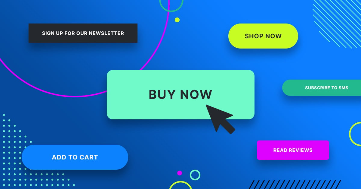
A strong call-to-action (CTA) is a crucial component in driving conversions, especially for high-ticket offers where the stakes and investment are significant. Crafting an effective CTA for high-ticket items involves more than just compelling language; it requires a strategic approach that aligns with your audience's needs and decision-making process. Here’s how to use a strong CTA to drive conversions for your high-ticket offer.
Understanding High-Ticket Offers
High-ticket offers involve products or services with substantial price tags. These offers often require more consideration and commitment from potential buyers. A strong CTA for high-ticket offers must address these factors by emphasizing value, creating urgency, and guiding the recipient through the decision-making process.
Crafting a Compelling CTA for High-Ticket Offers
Highlight the Unique Value Proposition
For high-ticket offers, it’s essential to clearly articulate the unique value proposition (UVP) in your CTA. The UVP should communicate why the offer is worth the investment and how it addresses the specific needs or pain points of your target audience.
Create a Sense of Urgency
Incorporate urgency into your CTA to prompt immediate action. High-ticket items often require a longer decision-making process, so emphasizing limited-time offers or scarcity can encourage quicker decisions.
Use Persuasive and Action-Oriented Language
The language in your CTA should be action-oriented and persuasive. Use strong verbs and compelling phrases that clearly guide the recipient on what to do next. Avoid vague language and be specific about the action you want them to take.
Designing an Effective CTA Button
Make the CTA Stand Out
Design your CTA button to stand out visually from the rest of the email or webpage. Use contrasting colors, a clear font, and a prominent size to ensure the CTA is easily noticeable and clickable.
Ensure Mobile Compatibility
Given the prevalence of mobile device usage, make sure your CTA button is optimized for mobile screens. The button should be large enough to tap easily and well-positioned within the mobile layout.
Positioning Your CTA Strategically
Place the CTA Above the Fold
Position your primary CTA above the fold, so it is immediately visible without scrolling. This placement ensures that recipients see the CTA as soon as they open the email or land on the webpage.
Reinforce with Additional CTAs
Include additional CTAs in strategic locations throughout the content. These secondary CTAs should support the primary CTA and offer additional opportunities for engagement.
Providing Clear and Valuable Benefits
Communicate the Benefits
Ensure that your CTA clearly communicates the benefits and value of taking the action. Potential buyers need to understand what they will gain from clicking the CTA and how it will benefit them.
Address Pain Points
Tailor your CTA to address specific pain points or challenges faced by your audience. Show how your high-ticket offer provides a solution or improvement in these areas.
Testing and Optimizing Your CTA
Conduct A/B Testing
Perform A/B testing to compare different versions of your CTA and determine which one performs best. Test variations in language, design, placement, and urgency to find the most effective combination.
Analyze Performance Metrics
Track and analyze key performance metrics such as click-through rates, conversion rates, and engagement levels. Use these insights to refine and optimize your CTA strategy for better results.
Integrating CTAs with the Sales Funnel
Align with Sales Stages
Ensure that your CTA aligns with the stage of the sales funnel that your audience is in. Tailor the CTA to match their current needs and decision-making stage.
Provide a Seamless Experience
Create a seamless experience from the CTA click to the conversion point. Ensure that the landing page or follow-up process is aligned with the expectations set by the CTA and provides a smooth transition.
Building Trust and Credibility
Include Social Proof
Incorporate social proof, such as testimonials, case studies, or success stories, near your CTA to build trust and credibility. This helps reassure potential buyers about the value of your high-ticket offer.
Offer a Risk-Free Guarantee
Providing a risk-free guarantee, such as a money-back guarantee or free trial, can reduce hesitation and encourage action. Make sure this guarantee is clearly communicated in your CTA.
FAQs
What makes a CTA effective for high-ticket offers?
An effective CTA for high-ticket offers clearly highlights the unique value proposition, creates a sense of urgency, uses persuasive language, and is designed to stand out. It should also address the specific needs and pain points of the audience.
How can I test the effectiveness of my CTA?
Conduct A/B testing to compare different CTA versions. Test variations in language, design, placement, and urgency. Analyze performance metrics such as click-through rates and conversion rates to determine which version is most effective.
What role does mobile optimization play in CTA effectiveness?
Mobile optimization is crucial because a significant portion of users access emails and websites via mobile devices. Ensure that your CTA button is large enough to tap, positioned well on the screen, and visually prominent to enhance usability and engagement.
How can I build trust with my CTA?
Build trust by including social proof, such as testimonials and success stories, and offering risk-free guarantees. These elements help reassure potential buyers about the value and credibility of your high-ticket offer.
How should I align my CTA with the sales funnel?
Ensure that your CTA aligns with the stage of the sales funnel your audience is in. Tailor the CTA to match their current needs and decision-making stage, and provide a seamless experience from the CTA click to the conversion point.


